Bar Chart (Horizontal)
Overview
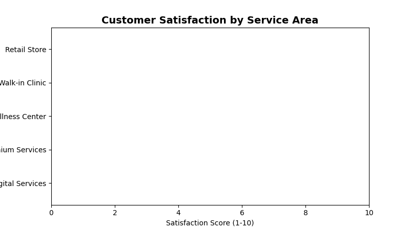
Displays data as horizontal bars, perfect for comparing categories with long names or when you have limited vertical space. Ideal for ranking data and comparing 2-3 categories with large disparities.
Sample Preview
Best Use Cases
- Service Area Rankings - Compare satisfaction scores across different service areas
- Top Performing Stores - Show best/worst performing locations
- Survey Response Categories - Display response volumes by category
Sample Data Structure
AskRITA UniversalChartData
from askrita.sqlagent.formatters.DataFormatter import UniversalChartData, ChartDataset, DataPoint

bar_data = UniversalChartData(
    type="horizontal_bar",
    title="Customer Satisfaction by Service Area",
    labels=["Retail Store", "Walk-in Clinic", "Wellness Center", "Premium Services", "Digital Services"],
    datasets=[
        ChartDataset(
            label="Satisfaction Score",
            data=[
                DataPoint(y=8.4, category="Retail Store"),
                DataPoint(y=8.7, category="Walk-in Clinic"),
                DataPoint(y=8.2, category="Wellness Center"),
                DataPoint(y=7.9, category="Premium Services"),
                DataPoint(y=7.1, category="Digital Services")
            ]
        )
    ],
    xAxisLabel="Satisfaction Score (1-10)",
    yAxisLabel="Service Areas"
)
Google Charts Implementation
HTML Structure
<!DOCTYPE html>
<html>
<head>
    <script type="text/javascript" src="https://www.gstatic.com/charts/loader.js"></script>
</head>
<body>
    <div id="bar_chart" style="width: 900px; height: 500px;"></div>
</body>
</html>
JavaScript Code
google.charts.load('current', {'packages':['corechart']});
google.charts.setOnLoadCallback(drawBarChart);

function drawBarChart() {
    var data = google.visualization.arrayToDataTable([
        ['Service Area', 'Satisfaction Score'],
        ['Retail Store', 8.4],
        ['Walk-in Clinic', 8.7],
        ['Wellness Center', 8.2],
        ['Premium Services', 7.9],
        ['Digital Services', 7.1]
    ]);

    var options = {
        title: 'Customer Satisfaction by Service Area',
        titleTextStyle: {
            fontSize: 18,
            bold: true
        },
        width: 900,
        height: 500,
        hAxis: {
            title: 'Satisfaction Score (1-10)',
            minValue: 0,
            maxValue: 10,
            format: '#.#'
        },
        vAxis: {
            title: 'Service Areas'
        },
        colors: ['#4285f4'],
        backgroundColor: 'white',
        chartArea: {
            left: 150,
            top: 80,
            width: '70%',
            height: '75%'
        },
        bar: {
            groupWidth: '75%'
        }
    };

    var chart = new google.visualization.BarChart(document.getElementById('bar_chart'));
    chart.draw(data, options);
}
React Implementation
import React, { useEffect, useRef } from 'react';

interface BarChartProps {
    data: Array<{
        category: string;
        value: number;
    }>;
    title?: string;
    width?: number;
    height?: number;
    xAxisLabel?: string;
    yAxisLabel?: string;
}

const HorizontalBarChart: React.FC<BarChartProps> = ({
    data,
    title = "Horizontal Bar Chart",
    width = 900,
    height = 500,
    xAxisLabel = "Value",
    yAxisLabel = "Category"
}) => {
    const chartRef = useRef<HTMLDivElement>(null);

    useEffect(() => {
        if (!window.google || !chartRef.current) return;

        const chartData = new google.visualization.DataTable();
        chartData.addColumn('string', 'Category');
        chartData.addColumn('number', 'Value');

        const rows = data.map(item => [item.category, item.value]);
        chartData.addRows(rows);

        const options = {
            title: title,
            width: width,
            height: height,
            hAxis: {
                title: xAxisLabel,
                minValue: 0
            },
            vAxis: {
                title: yAxisLabel
            },
            colors: ['#4285f4'],
            chartArea: {
                left: 150,
                top: 80,
                width: '70%',
                height: '75%'
            }
        };

        const chart = new google.visualization.BarChart(chartRef.current);
        chart.draw(chartData, options);
    }, [data, title, width, height, xAxisLabel, yAxisLabel]);

    return <div ref={chartRef} style={{ width: `${width}px`, height: `${height}px` }} />;
};

export default HorizontalBarChart;
Survey Data Examples
Top Performing Locations
// Best performing store locations
var data = google.visualization.arrayToDataTable([
    ['Store Location', 'NPS Score'],
    ['Store #1234 - Boston, MA', 85],
    ['Store #5678 - Austin, TX', 82],
    ['Store #9012 - Seattle, WA', 80],
    ['Store #3456 - Denver, CO', 78],
    ['Store #7890 - Phoenix, AZ', 76]
]);

var options = {
    title: 'Top 5 Performing Store Locations (NPS Score)',
    hAxis: {
        title: 'Net Promoter Score',
        minValue: 0,
        maxValue: 100
    },
    colors: ['#28a745']
};
Service Category Comparison
// Satisfaction across different service categories
var data = google.visualization.arrayToDataTable([
    ['Service Category', 'Average Rating'],
    ['Prescription Services', 8.7],
    ['Health Consultations', 8.4],
    ['Immunizations', 8.2],
    ['Health Screenings', 7.9],
    ['Digital App Experience', 7.1]
]);

var options = {
    title: 'Customer Satisfaction by Service Category',
    hAxis: {
        title: 'Average Rating (1-10 scale)',
        minValue: 0,
        maxValue: 10
    },
    colors: ['#ff7f0e'],
    bar: { groupWidth: '80%' }
};
Response Volume by Demographics
// Survey response volume by age group
var data = google.visualization.arrayToDataTable([
    ['Age Group', 'Response Count'],
    ['65+ Years', 12450],
    ['55-64 Years', 8920],
    ['45-54 Years', 6780],
    ['35-44 Years', 4560],
    ['25-34 Years', 3210],
    ['18-24 Years', 1890]
]);

var options = {
    title: 'Survey Response Volume by Age Group',
    hAxis: {
        title: 'Number of Responses',
        format: '#,###'
    },
    colors: ['#9467bd']
};
Advanced Features
Color Coding by Performance
function getColorForValue(value, threshold) {
    if (value >= threshold.high) return '#28a745'; // Green
    if (value >= threshold.medium) return '#ffc107'; // Yellow
    return '#dc3545'; // Red
}

// Apply conditional coloring
var data = google.visualization.arrayToDataTable([
    ['Service Area', 'Score', { role: 'style' }],
    ['Walk-in Clinic', 8.7, getColorForValue(8.7, {high: 8.0, medium: 7.0})],
    ['Retail Store', 8.4, getColorForValue(8.4, {high: 8.0, medium: 7.0})],
    ['Wellness Center', 8.2, getColorForValue(8.2, {high: 8.0, medium: 7.0})],
    ['Premium Services', 7.9, getColorForValue(7.9, {high: 8.0, medium: 7.0})],
    ['Digital Services', 7.1, getColorForValue(7.1, {high: 8.0, medium: 7.0})]
]);
Interactive Selection
function drawInteractiveBarChart() {
    var data = google.visualization.arrayToDataTable([
        ['Service Area', 'Score'],
        ['Walk-in Clinic', 8.7],
        ['Retail Store', 8.4],
        ['Wellness Center', 8.2],
        ['Premium Services', 7.9],
        ['Digital Services', 7.1]
    ]);

    var options = { title: 'Customer Satisfaction by Service Area' };
    var chart = new google.visualization.BarChart(document.getElementById('bar_chart'));

    google.visualization.events.addListener(chart, 'select', function() {
        var selection = chart.getSelection();
        if (selection.length > 0) {
            var row = selection[0].row;
            var category = data.getValue(row, 0);
            var value = data.getValue(row, 1);
            showDetailedAnalysis(category, value);
        }
    });

    chart.draw(data, options);
}

function showDetailedAnalysis(category, value) {
    // Load detailed data for selected category
    console.log(`Selected: ${category} with value ${value}`);
    // Could trigger a modal, navigate to detail page, etc.
}
Animated Updates
function animateBarChart() {
    var currentData = initialData;

    function updateChart() {
        // Simulate data updates
        for (let i = 1; i < currentData.getNumberOfRows(); i++) {
            const currentValue = currentData.getValue(i, 1);
            const newValue = currentValue + (Math.random() - 0.5) * 0.5;
            currentData.setValue(i, 1, Math.max(0, Math.min(10, newValue)));
        }

        chart.draw(currentData, options);
    }

    // Update every 3 seconds
    setInterval(updateChart, 3000);
}
Key Features
- Long Category Names - Horizontal layout accommodates lengthy labels
- Easy Comparison - Natural left-to-right reading pattern
- Space Efficient - Works well in narrow containers
- Color Coding - Visual performance indicators
- Interactive Selection - Click handling for drill-down
When to Use
✅ Perfect for: - Ranking/leaderboard displays - Long category names - Limited vertical space - 2-8 categories comparison - Performance scorecards
❌ Avoid when: - Many categories (>10) - Time series data - Part-to-whole relationships - Multiple data series needed
Responsive Design
function createResponsiveBarChart() {
    function drawChart() {
        const container = document.getElementById('bar_chart');
        const width = container.offsetWidth;
        const height = Math.max(300, data.getNumberOfRows() * 60 + 100);

        const options = {
            ...baseOptions,
            width: width,
            height: height,
            chartArea: {
                left: Math.max(100, width * 0.2),
                top: 60,
                width: width * 0.7,
                height: height - 120
            }
        };

        chart.draw(data, options);
    }

    drawChart();
    window.addEventListener('resize', debounce(drawChart, 250));
}