Line Chart
Overview
Displays data points connected by lines, perfect for showing trends over time or continuous data. The go-to choice for time series analysis and trend visualization.
Sample Preview
Best Use Cases
- Satisfaction Trends - Track NPS/CSAT scores over time
- Response Volume Trends - Monitor survey participation over time
- Performance Tracking - Show KPI improvements over periods
Sample Data Structure
AskRITA UniversalChartData
from askrita.sqlagent.formatters.DataFormatter import UniversalChartData, ChartDataset, DataPoint
line_data = UniversalChartData(
type="line",
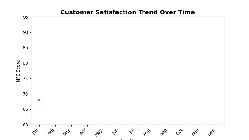
title="Customer Satisfaction Trend Over Time",
labels=["Jan", "Feb", "Mar", "Apr", "May", "Jun", "Jul", "Aug", "Sep", "Oct", "Nov", "Dec"],
datasets=[
ChartDataset(
label="NPS Score",
data=[
DataPoint(y=68, category="Jan"),
DataPoint(y=71, category="Feb"),
DataPoint(y=74, category="Mar"),
DataPoint(y=72, category="Apr"),
DataPoint(y=76, category="May"),
DataPoint(y=78, category="Jun"),
DataPoint(y=75, category="Jul"),
DataPoint(y=79, category="Aug"),
DataPoint(y=82, category="Sep"),
DataPoint(y=80, category="Oct"),
DataPoint(y=84, category="Nov"),
DataPoint(y=86, category="Dec")
]
)
],
xAxisLabel="Month",
yAxisLabel="NPS Score"
)
Google Charts Implementation
HTML Structure
<!DOCTYPE html>
<html>
<head>
    <script type="text/javascript" src="https://www.gstatic.com/charts/loader.js"></script>
</head>
<body>
    <div id="line_chart" style="width: 900px; height: 500px;"></div>
</body>
</html>
JavaScript Code
google.charts.load('current', {'packages':['corechart']});
google.charts.setOnLoadCallback(drawLineChart);

function drawLineChart() {
    var data = google.visualization.arrayToDataTable([
        ['Month', 'NPS Score'],
        ['Jan', 68],
        ['Feb', 71],
        ['Mar', 74],
        ['Apr', 72],
        ['May', 76],
        ['Jun', 78],
        ['Jul', 75],
        ['Aug', 79],
        ['Sep', 82],
        ['Oct', 80],
        ['Nov', 84],
        ['Dec', 86]
    ]);

    var options = {
        title: 'Customer Satisfaction Trend Over Time',
        titleTextStyle: {
            fontSize: 18,
            bold: true
        },
        width: 900,
        height: 500,
        hAxis: {
            title: 'Month'
        },
        vAxis: {
            title: 'NPS Score',
            minValue: 0,
            maxValue: 100
        },
        colors: ['#4285f4'],
        backgroundColor: 'white',
        chartArea: {
            left: 80,
            top: 80,
            width: '80%',
            height: '70%'
        },
        pointSize: 5,
        lineWidth: 3,
        curveType: 'function' // Smooth curves
    };

    var chart = new google.visualization.LineChart(document.getElementById('line_chart'));
    chart.draw(data, options);
}
Multi-Series Line Chart
function drawMultiSeriesLineChart() {
    var data = google.visualization.arrayToDataTable([
        ['Month', 'NPS Score', 'CSAT Score', 'Response Rate'],
        ['Jan', 68, 8.2, 45],
        ['Feb', 71, 8.4, 48],
        ['Mar', 74, 8.6, 52],
        ['Apr', 72, 8.3, 49],
        ['May', 76, 8.7, 55],
        ['Jun', 78, 8.9, 58],
        ['Jul', 75, 8.5, 53],
        ['Aug', 79, 9.1, 61],
        ['Sep', 82, 9.0, 64],
        ['Oct', 80, 8.8, 59],
        ['Nov', 84, 9.2, 67],
        ['Dec', 86, 9.4, 70]
    ]);

    var options = {
        title: 'Customer Experience Metrics Trend',
        width: 900,
        height: 500,
        hAxis: {
            title: 'Month'
        },
        vAxes: {
            0: {
                title: 'NPS Score / Response Rate (%)',
                textStyle: { color: '#4285f4' }
            },
            1: {
                title: 'CSAT Score (1-10)',
                textStyle: { color: '#34a853' }
            }
        },
        series: {
            0: {
                targetAxisIndex: 0,
                color: '#4285f4',
                lineWidth: 3,
                pointSize: 6
            },
            1: {
                targetAxisIndex: 1,
                color: '#34a853',
                lineWidth: 3,
                pointSize: 6
            },
            2: {
                targetAxisIndex: 0,
                color: '#fbbc04',
                lineWidth: 2,
                pointSize: 4,
                lineDashStyle: [5, 5]
            }
        },
        legend: {
            position: 'top',
            alignment: 'center'
        }
    };

    var chart = new google.visualization.LineChart(document.getElementById('line_chart'));
    chart.draw(data, options);
}
React Implementation
import React, { useEffect, useRef } from 'react';

interface LineChartProps {
    data: Array<{
        x: string | number;
        y: number;
        series?: string;
    }>;
    title?: string;
    width?: number;
    height?: number;
    xAxisLabel?: string;
    yAxisLabel?: string;
    smooth?: boolean;
    multiSeries?: boolean;
}

const LineChart: React.FC<LineChartProps> = ({
    data,
    title = "Line Chart",
    width = 900,
    height = 500,
    xAxisLabel = "X Axis",
    yAxisLabel = "Y Axis",
    smooth = true,
    multiSeries = false
}) => {
    const chartRef = useRef<HTMLDivElement>(null);

    useEffect(() => {
        if (!window.google || !chartRef.current) return;

        let chartData;

        if (multiSeries) {
            // Group data by x-value and series
            const grouped = data.reduce((acc, item) => {
                const key = item.x.toString();
                if (!acc[key]) acc[key] = {};
                acc[key][item.series || 'Value'] = item.y;
                return acc;
            }, {} as Record<string, Record<string, number>>);

            const xValues = Object.keys(grouped).sort();
            const series = [...new Set(data.map(item => item.series || 'Value'))];

            chartData = new google.visualization.DataTable();
            chartData.addColumn('string', 'X');
            series.forEach(s => chartData.addColumn('number', s));

            const rows = xValues.map(x => [
                x,
                ...series.map(s => grouped[x][s] || null)
            ]);
            chartData.addRows(rows);
        } else {
            chartData = new google.visualization.DataTable();
            chartData.addColumn('string', 'X');
            chartData.addColumn('number', 'Y');

            const rows = data.map(item => [item.x.toString(), item.y]);
            chartData.addRows(rows);
        }

        const options = {
            title: title,
            width: width,
            height: height,
            hAxis: {
                title: xAxisLabel
            },
            vAxis: {
                title: yAxisLabel
            },
            colors: ['#4285f4', '#34a853', '#fbbc04', '#ea4335'],
            chartArea: {
                left: 80,
                top: 80,
                width: '80%',
                height: '70%'
            },
            pointSize: 5,
            lineWidth: 3,
            curveType: smooth ? 'function' : 'none'
        };

        const chart = new google.visualization.LineChart(chartRef.current);
        chart.draw(chartData, options);
    }, [data, title, width, height, xAxisLabel, yAxisLabel, smooth, multiSeries]);

    return <div ref={chartRef} style={{ width: `${width}px`, height: `${height}px` }} />;
};

export default LineChart;
Survey Data Examples
Weekly Response Trends
// Weekly survey response volume
var data = google.visualization.arrayToDataTable([
    ['Week', 'Email Surveys', 'SMS Surveys', 'Phone Surveys'],
    ['Week 1', 2450, 890, 320],
    ['Week 2', 2680, 920, 340],
    ['Week 3', 2320, 850, 290],
    ['Week 4', 2890, 980, 380],
    ['Week 5', 3120, 1050, 420],
    ['Week 6', 2950, 990, 390],
    ['Week 7', 3340, 1120, 450],
    ['Week 8', 3580, 1200, 480]
]);

var options = {
    title: 'Weekly Survey Response Volume by Channel',
    hAxis: { title: 'Week' },
    vAxis: {
        title: 'Number of Responses',
        format: '#,###'
    },
    colors: ['#4285f4', '#34a853', '#fbbc04'],
    pointSize: 6,
    lineWidth: 3
};
Satisfaction Score Comparison
// Compare satisfaction across different service areas
var data = google.visualization.arrayToDataTable([
    ['Quarter', 'Retail Store', 'Walk-in Clinic', 'Wellness Center', 'Digital'],
    ['Q1 2023', 8.2, 8.5, 7.9, 6.8],
    ['Q2 2023', 8.4, 8.7, 8.1, 7.2],
    ['Q3 2023', 8.6, 8.8, 8.3, 7.5],
    ['Q4 2023', 8.5, 8.9, 8.2, 7.8],
    ['Q1 2024', 8.7, 9.0, 8.4, 8.1],
    ['Q2 2024', 8.8, 9.1, 8.6, 8.3]
]);

var options = {
    title: 'Quarterly Satisfaction Trends by Service Area',
    hAxis: { title: 'Quarter' },
    vAxis: {
        title: 'Satisfaction Score (1-10)',
        minValue: 6,
        maxValue: 10
    },
    colors: ['#1f77b4', '#ff7f0e', '#2ca02c', '#d62728'],
    pointSize: 5,
    lineWidth: 2
};
NPS Trend with Target Line
// NPS trend with target benchmark
var data = google.visualization.arrayToDataTable([
    ['Month', 'Actual NPS', 'Target NPS', 'Industry Average'],
    ['Jan', 68, 75, 65],
    ['Feb', 71, 75, 65],
    ['Mar', 74, 75, 66],
    ['Apr', 72, 75, 67],
    ['May', 76, 75, 68],
    ['Jun', 78, 75, 68],
    ['Jul', 75, 75, 69],
    ['Aug', 79, 75, 70],
    ['Sep', 82, 75, 71],
    ['Oct', 80, 75, 71],
    ['Nov', 84, 75, 72],
    ['Dec', 86, 75, 73]
]);

var options = {
    title: 'NPS Performance vs Target and Industry Average',
    hAxis: { title: 'Month' },
    vAxis: {
        title: 'NPS Score',
        minValue: 60,
        maxValue: 90
    },
    series: {
        0: {
            color: '#4285f4',
            lineWidth: 4,
            pointSize: 7
        },
        1: {
            color: '#ea4335',
            lineWidth: 2,
            lineDashStyle: [10, 5],
            pointSize: 0
        },
        2: {
            color: '#9aa0a6',
            lineWidth: 2,
            lineDashStyle: [5, 5],
            pointSize: 0
        }
    }
};
Advanced Features
Trend Lines and Annotations
function drawLineChartWithTrendline() {
    var data = google.visualization.arrayToDataTable([
        ['Month', 'NPS Score', 'Trendline'],
        ['Jan', 68, null],
        ['Feb', 71, null],
        ['Mar', 74, null],
        ['Apr', 72, null],
        ['May', 76, null],
        ['Jun', 78, null],
        ['Jul', 75, null],
        ['Aug', 79, null],
        ['Sep', 82, null],
        ['Oct', 80, null],
        ['Nov', 84, null],
        ['Dec', 86, null]
    ]);

    var options = {
        title: 'NPS Trend with Forecast',
        trendlines: {
            0: {
                type: 'linear',
                color: '#ff7f0e',
                lineWidth: 2,
                opacity: 0.8,
                showR2: true,
                visibleInLegend: true
            }
        },
        pointSize: 6,
        lineWidth: 3
    };

    var chart = new google.visualization.LineChart(document.getElementById('line_chart'));
    chart.draw(data, options);
}
Interactive Line Chart with Crossfilter
function drawInteractiveLineChart() {
    var chart = new google.visualization.LineChart(document.getElementById('line_chart'));

    // Add mouse over/out events for data point highlighting
    google.visualization.events.addListener(chart, 'onmouseover', function(e) {
        const row = e.row;
        const col = e.column;

        if (row !== null && col !== null) {
            highlightDataPoint(row, col);
        }
    });

    google.visualization.events.addListener(chart, 'select', function() {
        var selection = chart.getSelection();
        if (selection.length > 0) {
            var row = selection[0].row;
            var month = data.getValue(row, 0);
            var value = data.getValue(row, 1);

            showDetailedBreakdown(month, value);
        }
    });

    chart.draw(data, options);
}

function highlightDataPoint(row, col) {
    // Show tooltip or highlight related data
    const tooltip = document.getElementById('custom-tooltip');
    const month = data.getValue(row, 0);
    const series = data.getColumnLabel(col);
    const value = data.getValue(row, col);

    tooltip.innerHTML = `
        <strong>${series}</strong><br/>
        ${month}: ${value}
    `;
    tooltip.style.display = 'block';
}
Real-time Updating Line Chart
function createRealTimeLineChart() {
    let currentData = initialData;

    function addDataPoint() {
        const now = new Date();
        const timeLabel = now.toLocaleTimeString();
        const newValue = Math.random() * 20 + 70; // Random NPS between 70-90

        // Add new data point
        currentData.addRow([timeLabel, newValue]);

        // Keep only last 20 points
        if (currentData.getNumberOfRows() > 20) {
            currentData.removeRow(0);
        }

        chart.draw(currentData, options);
    }

    // Update every 5 seconds
    setInterval(addDataPoint, 5000);
}
Area Chart Variant
function drawAreaChart() {
    var data = google.visualization.arrayToDataTable([
        ['Month', 'Promoters', 'Passives', 'Detractors'],
        ['Jan', 45, 35, 20],
        ['Feb', 48, 32, 20],
        ['Mar', 52, 30, 18],
        ['Apr', 49, 33, 18],
        ['May', 55, 30, 15],
        ['Jun', 58, 28, 14]
    ]);

    var options = {
        title: 'NPS Composition Over Time',
        isStacked: true,
        areaOpacity: 0.7,
        colors: ['#28a745', '#ffc107', '#dc3545'],
        hAxis: { title: 'Month' },
        vAxis: { title: 'Percentage of Customers' }
    };

    var chart = new google.visualization.AreaChart(document.getElementById('area_chart'));
    chart.draw(data, options);
}
Key Features
- Trend Visualization - Clear representation of changes over time
- Multiple Series - Compare multiple metrics simultaneously
- Smooth Curves - Optional curve smoothing for better visual flow
- Interactive Points - Hover and click interactions
- Trend Lines - Built-in trend analysis capabilities
When to Use
✅ Perfect for: - Time series data - Trend analysis - Continuous data visualization - Performance tracking over time - Comparative trend analysis
❌ Avoid when: - Categorical data without order - Part-to-whole relationships - Too many series (>5-6) - Discrete data points without connection
Performance Optimization
// For large datasets, consider data sampling
function sampleData(data, maxPoints = 100) {
    if (data.length <= maxPoints) return data;

    const step = Math.floor(data.length / maxPoints);
    return data.filter((_, index) => index % step === 0);
}

// Or use data aggregation
function aggregateByPeriod(data, period = 'week') {
    // Group data points by week/month and average values
    const grouped = data.reduce((acc, item) => {
        const key = getPeriodKey(item.date, period);
        if (!acc[key]) acc[key] = [];
        acc[key].push(item.value);
        return acc;
    }, {});

    return Object.keys(grouped).map(key => ({
        period: key,
        value: grouped[key].reduce((sum, val) => sum + val, 0) / grouped[key].length
    }));
}