Bar-and-Line Chart (ComboChart)
Overview
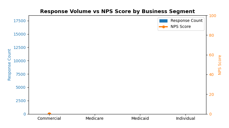
Combines bar charts and line charts in a single visualization with dual Y-axes. Perfect for showing volume metrics (bars) alongside performance metrics (lines) like response counts with NPS scores.
Sample Preview
Best Use Cases
- Response Volume + NPS Scores - Show survey response counts with satisfaction scores
- Customer Count + Satisfaction - Display customer base size with happiness metrics
- Campaign Reach + Engagement - Combine volume metrics with quality indicators
Sample Data Structure
AskRITA UniversalChartData
from askrita.sqlagent.formatters.DataFormatter import UniversalChartData, ChartDataset, DataPoint, AxisConfig

combo_data = UniversalChartData(
    type="combo",
    title="Response Volume vs NPS Score by Business Segment",
    labels=["Commercial", "Medicare", "Medicaid", "Individual"],
    datasets=[
        ChartDataset(
            label="Response Count",
            data=[
                DataPoint(y=15420, category="Commercial"),
                DataPoint(y=8932, category="Medicare"),
                DataPoint(y=5621, category="Medicaid"),
                DataPoint(y=2103, category="Individual")
            ],
            yAxisId="left-axis"
        ),
        ChartDataset(
            label="NPS Score",
            data=[
                DataPoint(y=72, category="Commercial"),
                DataPoint(y=68, category="Medicare"),
                DataPoint(y=45, category="Medicaid"),
                DataPoint(y=38, category="Individual")
            ],
            yAxisId="right-axis"
        )
    ],
    yAxes=[
        AxisConfig(axisId="left-axis", position="left", label="Response Count"),
        AxisConfig(axisId="right-axis", position="right", label="NPS Score")
    ]
)
Google Charts Implementation
HTML Structure
<!DOCTYPE html>
<html>
<head>
    <script type="text/javascript" src="https://www.gstatic.com/charts/loader.js"></script>
</head>
<body>
    <div id="combo_chart" style="width: 900px; height: 500px;"></div>
</body>
</html>
JavaScript Code
google.charts.load('current', {'packages':['corechart']});
google.charts.setOnLoadCallback(drawComboChart);

function drawComboChart() {
    var data = google.visualization.arrayToDataTable([
        ['Business Segment', 'Response Count', 'NPS Score'],
        ['Commercial',       15420,           72],
        ['Medicare',         8932,            68],
        ['Medicaid',         5621,            45],
        ['Individual',       2103,            38]
    ]);

    var options = {
        title: 'Response Volume vs NPS Score by Business Segment',
        titleTextStyle: {
            fontSize: 18,
            bold: true
        },
        width: 900,
        height: 500,
        vAxes: {
            0: {
                title: 'Response Count',
                textStyle: {color: '#1f77b4'},
                titleTextStyle: {color: '#1f77b4'},
                format: '#,###'
            },
            1: {
                title: 'NPS Score',
                textStyle: {color: '#ff7f0e'},
                titleTextStyle: {color: '#ff7f0e'},
                minValue: 0,
                maxValue: 100
            }
        },
        hAxis: {
            title: 'Business Segment',
            titleTextStyle: {fontSize: 14}
        },
        series: {
            0: {
                type: 'columns',
                targetAxisIndex: 0,
                color: '#1f77b4'
            },
            1: {
                type: 'line',
                targetAxisIndex: 1,
                color: '#ff7f0e',
                lineWidth: 3,
                pointSize: 8
            }
        },
        legend: {
            position: 'top',
            alignment: 'center'
        },
        backgroundColor: 'white',
        chartArea: {
            left: 80,
            top: 80,
            width: '75%',
            height: '70%'
        }
    };

    var chart = new google.visualization.ComboChart(document.getElementById('combo_chart'));
    chart.draw(data, options);
}
React Implementation
import React, { useEffect, useRef } from 'react';

interface ComboChartProps {
    data: Array<{
        segment: string;
        responseCount: number;
        npsScore: number;
    }>;
}

const ComboChart: React.FC<ComboChartProps> = ({ data }) => {
    const chartRef = useRef<HTMLDivElement>(null);

    useEffect(() => {
        if (!window.google || !chartRef.current) return;

        const chartData = new google.visualization.DataTable();
        chartData.addColumn('string', 'Business Segment');
        chartData.addColumn('number', 'Response Count');
        chartData.addColumn('number', 'NPS Score');

        const rows = data.map(item => [
            item.segment,
            item.responseCount,
            item.npsScore
        ]);
        chartData.addRows(rows);

        const options = {
            title: 'Response Volume vs NPS Score by Business Segment',
            width: 900,
            height: 500,
            vAxes: {
                0: {
                    title: 'Response Count',
                    textStyle: {color: '#1f77b4'},
                    titleTextStyle: {color: '#1f77b4'}
                },
                1: {
                    title: 'NPS Score',
                    textStyle: {color: '#ff7f0e'},
                    titleTextStyle: {color: '#ff7f0e'},
                    minValue: 0,
                    maxValue: 100
                }
            },
            series: {
                0: {type: 'columns', targetAxisIndex: 0, color: '#1f77b4'},
                1: {type: 'line', targetAxisIndex: 1, color: '#ff7f0e'}
            }
        };

        const chart = new google.visualization.ComboChart(chartRef.current);
        chart.draw(chartData, options);
    }, [data]);

    return <div ref={chartRef} style={{ width: '900px', height: '500px' }} />;
};

export default ComboChart;
Survey Data Examples
Customer Satisfaction by Channel
// Response volume + CSAT scores by support channel
var data = google.visualization.arrayToDataTable([
    ['Channel', 'Response Count', 'CSAT Score'],
    ['Email',    2450,           8.2],
    ['Phone',    1890,           7.8],
    ['Chat',     1205,           8.5],
    ['Web',      820,            7.1]
]);
Regional Performance Analysis
// Survey responses + NPS by region
var data = google.visualization.arrayToDataTable([
    ['Region', 'Survey Count', 'NPS Score'],
    ['Northeast', 5420,         74],
    ['Southeast', 4932,         68],
    ['Midwest',   3621,         71],
    ['West',      6103,         76]
]);
Key Features
- Dual Y-Axes - Different scales for volume vs scores
- Color Coordination - Matching colors for axes and series
- Interactive Tooltips - Hover for detailed information
- Responsive Design - Adapts to container size
- Export Options - Built-in PNG/PDF export
When to Use
✅ Perfect for: - Volume + Quality metrics - Count + Score combinations - Trend + Performance data - Any metrics with 10x+ scale differences
❌ Avoid when: - Both metrics have similar scales - More than 2 metrics needed - Data is time-series focused (use line chart instead)