Data Table with Sparklines
Overview
Displays tabular data with embedded mini-charts (sparklines) in cells. Perfect for showing detailed data alongside visual trends, combining the precision of tables with the insight of charts.
Sample Preview
Best Use Cases
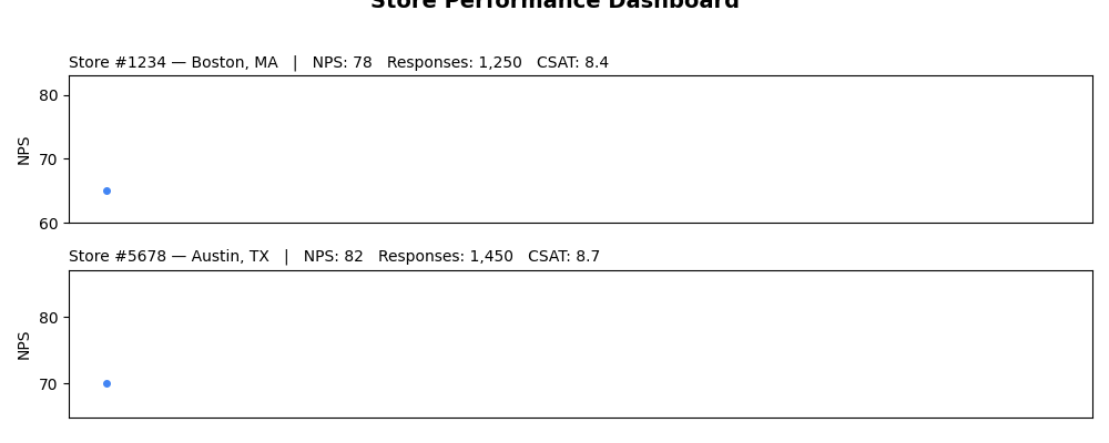
- Store Performance Dashboard - Show store metrics with trend sparklines
- Customer Segment Analysis - Display segment data with satisfaction trends
- Monthly Reports - Present KPIs with historical trend visualization
Sample Data Structure
AskRITA UniversalChartData
from askrita.sqlagent.formatters.DataFormatter import UniversalChartData

table_data = UniversalChartData(
    type="table",
    title="Store Performance Dashboard",
    datasets=[],  # Empty for table charts
    table_data=[
        {
            "store_id": "Store #1234",
            "location": "Boston, MA",
            "current_nps": 78,
            "nps_trend": [65, 68, 71, 74, 76, 78],
            "monthly_responses": 1250,
            "response_trend": [980, 1050, 1120, 1180, 1220, 1250],
            "satisfaction": 8.4,
            "satisfaction_trend": [8.0, 8.1, 8.2, 8.3, 8.3, 8.4]
        },
        {
            "store_id": "Store #5678",
            "location": "Austin, TX",
            "current_nps": 82,
            "nps_trend": [70, 73, 76, 78, 80, 82],
            "monthly_responses": 1450,
            "response_trend": [1200, 1280, 1320, 1380, 1420, 1450],
            "satisfaction": 8.7,
            "satisfaction_trend": [8.2, 8.3, 8.4, 8.5, 8.6, 8.7]
        }
    ]
)
Google Charts Implementation
HTML Structure
<!DOCTYPE html>
<html>
<head>
    <script type="text/javascript" src="https://www.gstatic.com/charts/loader.js"></script>
</head>
<body>
    <div id="table_chart" style="width: 1200px; height: 500px;"></div>
</body>
</html>
JavaScript Code
google.charts.load('current', {'packages':['table']});
google.charts.setOnLoadCallback(drawTableChart);

function drawTableChart() {
    var data = new google.visualization.DataTable();

    // Define columns
    data.addColumn('string', 'Store ID');
    data.addColumn('string', 'Location');
    data.addColumn('number', 'Current NPS');
    data.addColumn('string', 'NPS Trend');
    data.addColumn('number', 'Monthly Responses');
    data.addColumn('string', 'Response Trend');
    data.addColumn('number', 'Satisfaction');
    data.addColumn('string', 'Satisfaction Trend');

    // Add rows with sparkline data
    data.addRows([
        [
            'Store #1234',
            'Boston, MA',
            78,
            createSparklineHTML([65, 68, 71, 74, 76, 78], 'line'),
            1250,
            createSparklineHTML([980, 1050, 1120, 1180, 1220, 1250], 'column'),
            8.4,
            createSparklineHTML([8.0, 8.1, 8.2, 8.3, 8.3, 8.4], 'line')
        ],
        [
            'Store #5678',
            'Austin, TX',
            82,
            createSparklineHTML([70, 73, 76, 78, 80, 82], 'line'),
            1450,
            createSparklineHTML([1200, 1280, 1320, 1380, 1420, 1450], 'column'),
            8.7,
            createSparklineHTML([8.2, 8.3, 8.4, 8.5, 8.6, 8.7], 'line')
        ],
        [
            'Store #9012',
            'Seattle, WA',
            75,
            createSparklineHTML([68, 70, 72, 73, 74, 75], 'line'),
            1180,
            createSparklineHTML([950, 1020, 1080, 1120, 1150, 1180], 'column'),
            8.1,
            createSparklineHTML([7.8, 7.9, 8.0, 8.0, 8.1, 8.1], 'line')
        ],
        [
            'Store #3456',
            'Denver, CO',
            85,
            createSparklineHTML([75, 78, 80, 82, 84, 85], 'line'),
            890,
            createSparklineHTML([720, 780, 820, 850, 870, 890], 'column'),
            8.9,
            createSparklineHTML([8.3, 8.4, 8.6, 8.7, 8.8, 8.9], 'line')
        ]
    ]);

    var options = {
        title: 'Store Performance Dashboard',
        titleTextStyle: {
            fontSize: 18,
            bold: true
        },
        width: 1200,
        height: 500,
        allowHtml: true, // Enable HTML content in cells
        alternatingRowStyle: false,
        cssClassNames: {
            'headerRow': 'table-header',
            'tableRow': 'table-row',
            'evenTableRow': 'table-row-even'
        },
        sort: 'enable'
    };

    var chart = new google.visualization.Table(document.getElementById('table_chart'));
    chart.draw(data, options);
}

function createSparklineHTML(values, type = 'line') {
    const width = 100;
    const height = 30;
    const max = Math.max(...values);
    const min = Math.min(...values);
    const range = max - min || 1;

    if (type === 'line') {
        // Create SVG line sparkline
        const points = values.map((value, index) => {
            const x = (index / (values.length - 1)) * width;
            const y = height - ((value - min) / range) * height;
            return `${x},${y}`;
        }).join(' ');

        return `<svg width="${width}" height="${height}" style="display: block;">
                    <polyline points="${points}"
                              fill="none"
                              stroke="#4285f4"
                              stroke-width="2"/>
                </svg>`;
    } else if (type === 'column') {
        // Create SVG column sparkline
        const barWidth = width / values.length - 1;
        const bars = values.map((value, index) => {
            const x = index * (barWidth + 1);
            const barHeight = ((value - min) / range) * height;
            const y = height - barHeight;
            return `<rect x="${x}" y="${y}" width="${barWidth}" height="${barHeight}" fill="#34a853"/>`;
        }).join('');

        return `<svg width="${width}" height="${height}" style="display: block;">
                    ${bars}
                </svg>`;
    }
}
React Implementation
import React, { useEffect, useRef } from 'react';

interface TableRow {
    [key: string]: any;
    sparklines?: { [column: string]: number[] };
}

interface TableChartProps {
    data: TableRow[];
    columns: Array<{
        id: string;
        label: string;
        type: 'string' | 'number' | 'sparkline';
        sparklineType?: 'line' | 'column';
    }>;
    title?: string;
    width?: number;
    height?: number;
    sortable?: boolean;
}

const TableChart: React.FC<TableChartProps> = ({
    data,
    columns,
    title = "Data Table",
    width = 1200,
    height = 500,
    sortable = true
}) => {
    const chartRef = useRef<HTMLDivElement>(null);

    useEffect(() => {
        if (!window.google || !chartRef.current) return;

        const dataTable = new google.visualization.DataTable();

        // Add columns
        columns.forEach(col => {
            if (col.type === 'sparkline') {
                dataTable.addColumn('string', col.label);
            } else {
                dataTable.addColumn(col.type, col.label);
            }
        });

        // Add rows
        const rows = data.map(row => {
            return columns.map(col => {
                if (col.type === 'sparkline' && row.sparklines && row.sparklines[col.id]) {
                    return createSparklineHTML(row.sparklines[col.id], col.sparklineType || 'line');
                }
                return row[col.id];
            });
        });
        dataTable.addRows(rows);

        const options = {
            title: title,
            width: width,
            height: height,
            allowHtml: true,
            sort: sortable ? 'enable' : 'disable',
            alternatingRowStyle: false
        };

        const chart = new google.visualization.Table(chartRef.current);
        chart.draw(dataTable, options);
    }, [data, columns, title, width, height, sortable]);

    const createSparklineHTML = (values: number[], type: 'line' | 'column') => {
        const width = 100;
        const height = 30;
        const max = Math.max(...values);
        const min = Math.min(...values);
        const range = max - min || 1;

        if (type === 'line') {
            const points = values.map((value, index) => {
                const x = (index / (values.length - 1)) * width;
                const y = height - ((value - min) / range) * height;
                return `${x},${y}`;
            }).join(' ');

            return `<svg width="${width}" height="${height}">
                        <polyline points="${points}" fill="none" stroke="#4285f4" stroke-width="2"/>
                    </svg>`;
        } else {
            const barWidth = width / values.length - 1;
            const bars = values.map((value, index) => {
                const x = index * (barWidth + 1);
                const barHeight = ((value - min) / range) * height;
                const y = height - barHeight;
                return `<rect x="${x}" y="${y}" width="${barWidth}" height="${barHeight}" fill="#34a853"/>`;
            }).join('');

            return `<svg width="${width}" height="${height}">${bars}</svg>`;
        }
    };

    return <div ref={chartRef} style={{ width: `${width}px`, height: `${height}px` }} />;
};

export default TableChart;
Survey Data Examples
Customer Segment Performance
// Customer segment analysis with trends
function drawSegmentTable() {
    var data = new google.visualization.DataTable();

    data.addColumn('string', 'Segment');
    data.addColumn('number', 'Customers');
    data.addColumn('string', 'Growth Trend');
    data.addColumn('number', 'Avg NPS');
    data.addColumn('string', 'NPS Trend');
    data.addColumn('number', 'Satisfaction');
    data.addColumn('string', 'Satisfaction Trend');
    data.addColumn('number', 'Response Rate %');

    data.addRows([
        [
            'Premium Members',
            12450,
            createSparklineHTML([10200, 10800, 11300, 11800, 12100, 12450], 'column'),
            85,
            createSparklineHTML([78, 80, 82, 83, 84, 85], 'line'),
            9.1,
            createSparklineHTML([8.6, 8.7, 8.8, 8.9, 9.0, 9.1], 'line'),
            78
        ],
        [
            'Regular Customers',
            45890,
            createSparklineHTML([43200, 44100, 44800, 45200, 45600, 45890], 'column'),
            72,
            createSparklineHTML([68, 69, 70, 71, 71, 72], 'line'),
            8.3,
            createSparklineHTML([8.0, 8.1, 8.1, 8.2, 8.2, 8.3], 'line'),
            65
        ],
        [
            'New Customers',
            8920,
            createSparklineHTML([6500, 7200, 7800, 8200, 8600, 8920], 'column'),
            68,
            createSparklineHTML([62, 64, 65, 66, 67, 68], 'line'),
            7.8,
            createSparklineHTML([7.2, 7.3, 7.5, 7.6, 7.7, 7.8], 'line'),
            52
        ]
    ]);

    var options = {
        title: 'Customer Segment Performance Analysis',
        width: 1200,
        height: 400,
        allowHtml: true,
        sort: 'enable'
    };

    var chart = new google.visualization.Table(document.getElementById('table_chart'));
    chart.draw(data, options);
}
Regional Performance Dashboard
// Regional performance with multiple metrics
function drawRegionalTable() {
    var data = new google.visualization.DataTable();

    data.addColumn('string', 'Region');
    data.addColumn('string', 'Top Store');
    data.addColumn('number', 'Stores Count');
    data.addColumn('number', 'Total Responses');
    data.addColumn('string', 'Response Trend');
    data.addColumn('number', 'Avg NPS');
    data.addColumn('string', 'NPS Trend');
    data.addColumn('number', 'CSAT Score');
    data.addColumn('string', 'CSAT Trend');

    data.addRows([
        [
            'Northeast',
            'Boston Downtown #1234',
            145,
            18450,
            createSparklineHTML([16200, 16800, 17300, 17800, 18100, 18450], 'column'),
            74,
            createSparklineHTML([70, 71, 72, 73, 73, 74], 'line'),
            8.4,
            createSparklineHTML([8.0, 8.1, 8.2, 8.3, 8.3, 8.4], 'line')
        ],
        [
            'Southeast',
            'Atlanta Midtown #5678',
            189,
            22890,
            createSparklineHTML([20100, 20900, 21500, 22000, 22400, 22890], 'column'),
            71,
            createSparklineHTML([67, 68, 69, 70, 70, 71], 'line'),
            8.1,
            createSparklineHTML([7.8, 7.9, 8.0, 8.0, 8.1, 8.1], 'line')
        ],
        [
            'West',
            'Seattle Capitol Hill #9012',
            167,
            19780,
            createSparklineHTML([17800, 18400, 18900, 19300, 19600, 19780], 'column'),
            76,
            createSparklineHTML([72, 73, 74, 75, 75, 76], 'line'),
            8.6,
            createSparklineHTML([8.2, 8.3, 8.4, 8.5, 8.5, 8.6], 'line')
        ]
    ]);

    var options = {
        title: 'Regional Performance Dashboard',
        width: 1200,
        height: 350,
        allowHtml: true
    };

    var chart = new google.visualization.Table(document.getElementById('table_chart'));
    chart.draw(data, options);
}
Campaign Performance Tracker
// Survey campaign performance with trends
function drawCampaignTable() {
    var data = new google.visualization.DataTable();

    data.addColumn('string', 'Campaign');
    data.addColumn('string', 'Channel');
    data.addColumn('date', 'Start Date');
    data.addColumn('date', 'End Date');
    data.addColumn('number', 'Total Sent');
    data.addColumn('number', 'Responses');
    data.addColumn('string', 'Daily Response Trend');
    data.addColumn('number', 'Response Rate %');
    data.addColumn('number', 'Avg Score');
    data.addColumn('string', 'Score Trend');

    data.addRows([
        [
            'Q1 Customer Satisfaction',
            'Email',
            new Date(2024, 0, 15),
            new Date(2024, 1, 15),
            25000,
            3450,
            createSparklineHTML([45, 120, 180, 210, 195, 165, 140, 120, 95, 80], 'column'),
            13.8,
            8.2,
            createSparklineHTML([7.8, 8.0, 8.1, 8.2, 8.3, 8.2, 8.1, 8.2, 8.3, 8.2], 'line')
        ],
        [
            'Post-Visit NPS',
            'SMS',
            new Date(2024, 1, 1),
            new Date(2024, 11, 31),
            180000,
            28900,
            createSparklineHTML([78, 82, 85, 88, 92, 89, 85, 87, 90, 88], 'column'),
            16.1,
            7.9,
            createSparklineHTML([7.5, 7.6, 7.7, 7.8, 7.9, 8.0, 7.9, 7.8, 7.9, 7.9], 'line')
        ],
        [
            'Annual Health Survey',
            'Phone',
            new Date(2024, 8, 1),
            new Date(2024, 9, 30),
            5000,
            1890,
            createSparklineHTML([25, 45, 65, 85, 95, 88, 82, 78, 65, 45], 'column'),
            37.8,
            8.7,
            createSparklineHTML([8.3, 8.4, 8.5, 8.6, 8.7, 8.8, 8.7, 8.6, 8.7, 8.7], 'line')
        ]
    ]);

    var options = {
        title: 'Survey Campaign Performance Tracker',
        width: 1400,
        height: 400,
        allowHtml: true
    };

    var chart = new google.visualization.Table(document.getElementById('table_chart'));
    chart.draw(data, options);
}
Advanced Features
Interactive Table with Drill-Down
function drawInteractiveTable() {
    var chart = new google.visualization.Table(document.getElementById('table_chart'));

    google.visualization.events.addListener(chart, 'select', function() {
        var selection = chart.getSelection();
        if (selection.length > 0) {
            var row = selection[0].row;
            var storeId = data.getValue(row, 0);
            showStoreDetails(storeId);
        }
    });

    chart.draw(data, options);
}

function showStoreDetails(storeId) {
    // Load detailed store data
    const detailPanel = document.getElementById('store-details');
    detailPanel.innerHTML = `
        <div class="store-detail">
            <h4>${storeId} - Detailed Analysis</h4>
            <div id="store-detail-charts"></div>
            <button onclick="loadFullReport('${storeId}')">Full Report</button>
        </div>
    `;
    detailPanel.style.display = 'block';

    // Load additional charts for the selected store
    loadStoreCharts(storeId);
}
Custom Formatting and Styling
// Enhanced sparkline with custom styling
function createAdvancedSparkline(values, type, options = {}) {
    const {
        width = 100,
        height = 30,
        color = '#4285f4',
        fillColor = 'rgba(66, 133, 244, 0.1)',
        showPoints = false,
        lineWidth = 2
    } = options;

    const max = Math.max(...values);
    const min = Math.min(...values);
    const range = max - min || 1;

    if (type === 'area') {
        const points = values.map((value, index) => {
            const x = (index / (values.length - 1)) * width;
            const y = height - ((value - min) / range) * height;
            return `${x},${y}`;
        }).join(' ');

        const areaPoints = `0,${height} ${points} ${width},${height}`;

        return `<svg width="${width}" height="${height}">
                    <polygon points="${areaPoints}" fill="${fillColor}" stroke="none"/>
                    <polyline points="${points}" fill="none" stroke="${color}" stroke-width="${lineWidth}"/>
                    ${showPoints ? createSparklinePoints(values, width, height, min, range, color) : ''}
                </svg>`;
    }

    return createSparklineHTML(values, type);
}

function createSparklinePoints(values, width, height, min, range, color) {
    return values.map((value, index) => {
        const x = (index / (values.length - 1)) * width;
        const y = height - ((value - min) / range) * height;
        return `<circle cx="${x}" cy="${y}" r="2" fill="${color}"/>`;
    }).join('');
}
Conditional Formatting
function applyConditionalFormatting(data) {
    // Apply color coding based on values
    for (let row = 0; row < data.getNumberOfRows(); row++) {
        const npsValue = data.getValue(row, 2); // NPS column
        const satisfactionValue = data.getValue(row, 6); // Satisfaction column

        // Color code NPS values
        if (npsValue >= 80) {
            data.setProperty(row, 2, 'style', 'background-color: #d4edda; color: #155724;');
        } else if (npsValue < 60) {
            data.setProperty(row, 2, 'style', 'background-color: #f8d7da; color: #721c24;');
        }

        // Color code satisfaction values
        if (satisfactionValue >= 8.5) {
            data.setProperty(row, 6, 'style', 'background-color: #d4edda; color: #155724;');
        } else if (satisfactionValue < 7.5) {
            data.setProperty(row, 6, 'style', 'background-color: #f8d7da; color: #721c24;');
        }
    }
}
Key Features
- Tabular Precision - Exact values alongside visual trends
- Embedded Charts - Sparklines provide context without clutter
- Sortable Columns - Interactive sorting for data exploration
- Custom Formatting - Conditional formatting and styling
- Mixed Data Types - Numbers, text, dates, and visualizations
When to Use
✅ Perfect for: - Executive dashboards - Performance scorecards - Detailed data reports - Comparative analysis - KPI tracking with trends
❌ Avoid when: - Simple data visualization - Large datasets (>100 rows) - Mobile-first interfaces - Print-friendly reports
CSS Styling
.google-visualization-table-table {
    font-family: Arial, sans-serif;
    border-collapse: collapse;
    width: 100%;
}

.table-header {
    background-color: #f8f9fa;
    font-weight: bold;
    border-bottom: 2px solid #dee2e6;
}

.table-row {
    border-bottom: 1px solid #dee2e6;
}

.table-row-even {
    background-color: #f8f9fa;
}

.table-row:hover {
    background-color: #e9ecef;
}