Gauge Chart
Overview
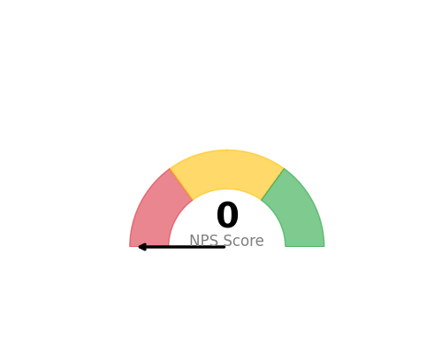
Displays a single KPI value as a speedometer-style gauge with configurable min/max ranges and color zones. Perfect for showing current performance against targets.
Sample Preview
Best Use Cases
- Current NPS Score - Show current satisfaction level with target zones
- Response Rate - Display completion percentage with threshold indicators
- Performance KPIs - Single metric dashboards with target ranges
Sample Data Structure
AskRITA UniversalChartData
from askrita.sqlagent.formatters.DataFormatter import UniversalChartData

gauge_data = UniversalChartData(
    type="gauge",
    title="Current NPS Score",
    datasets=[],  # Empty for gauge charts
    gauge_value=72,
    gauge_min=0,
    gauge_max=100
)
Google Charts Implementation
HTML Structure
<!DOCTYPE html>
<html>
<head>
    <script type="text/javascript" src="https://www.gstatic.com/charts/loader.js"></script>
</head>
<body>
    <div id="gauge_chart" style="width: 400px; height: 300px;"></div>
</body>
</html>
JavaScript Code
google.charts.load('current', {'packages':['gauge']});
google.charts.setOnLoadCallback(drawGaugeChart);

function drawGaugeChart() {
    var data = google.visualization.arrayToDataTable([
        ['Label', 'Value'],
        ['NPS Score', 72]
    ]);

    var options = {
        title: 'Current NPS Score',
        titleTextStyle: {
            fontSize: 16,
            bold: true
        },
        width: 400,
        height: 300,
        redFrom: 0,
        redTo: 30,
        yellowFrom: 30,
        yellowTo: 70,
        greenFrom: 70,
        greenTo: 100,
        minorTicks: 5,
        majorTicks: ['0', '20', '40', '60', '80', '100'],
        min: 0,
        max: 100
    };

    var chart = new google.visualization.Gauge(document.getElementById('gauge_chart'));
    chart.draw(data, options);
}
Multiple Gauges
function drawMultipleGauges() {
    var data = google.visualization.arrayToDataTable([
        ['Label', 'Value'],
        ['NPS', 72],
        ['CSAT', 8.2],
        ['Response Rate', 85]
    ]);

    var options = {
        title: 'Key Performance Indicators',
        width: 600,
        height: 300,
        redFrom: 0,
        redTo: 25,
        yellowFrom: 25,
        yellowTo: 75,
        greenFrom: 75,
        greenTo: 100,
        minorTicks: 5
    };

    var chart = new google.visualization.Gauge(document.getElementById('gauges_chart'));
    chart.draw(data, options);
}
React Implementation
import React, { useEffect, useRef } from 'react';

interface GaugeChartProps {
    value: number;
    label: string;
    min?: number;
    max?: number;
    redZone?: [number, number];
    yellowZone?: [number, number];
    greenZone?: [number, number];
}

const GaugeChart: React.FC<GaugeChartProps> = ({
    value,
    label,
    min = 0,
    max = 100,
    redZone = [0, 30],
    yellowZone = [30, 70],
    greenZone = [70, 100]
}) => {
    const chartRef = useRef<HTMLDivElement>(null);

    useEffect(() => {
        if (!window.google || !chartRef.current) return;

        const data = new google.visualization.DataTable();
        data.addColumn('string', 'Label');
        data.addColumn('number', 'Value');
        data.addRow([label, value]);

        const options = {
            title: `Current ${label}`,
            width: 400,
            height: 300,
            redFrom: redZone[0],
            redTo: redZone[1],
            yellowFrom: yellowZone[0],
            yellowTo: yellowZone[1],
            greenFrom: greenZone[0],
            greenTo: greenZone[1],
            minorTicks: 5,
            min: min,
            max: max
        };

        const chart = new google.visualization.Gauge(chartRef.current);
        chart.draw(data, options);
    }, [value, label, min, max, redZone, yellowZone, greenZone]);

    return <div ref={chartRef} style={{ width: '400px', height: '300px' }} />;
};

export default GaugeChart;
Survey Data Examples
NPS Score Gauge
// Current NPS with industry benchmarks
var data = google.visualization.arrayToDataTable([
    ['Metric', 'Score'],
    ['NPS', 72]
]);

var options = {
    title: 'Net Promoter Score',
    redFrom: 0, redTo: 30,      // Detractors zone
    yellowFrom: 30, yellowTo: 70, // Passives zone
    greenFrom: 70, greenTo: 100,  // Promoters zone
    majorTicks: ['0', '25', '50', '75', '100']
};
CSAT Score (0-10 Scale)
// Customer Satisfaction on 10-point scale
var data = google.visualization.arrayToDataTable([
    ['Metric', 'Score'],
    ['CSAT', 8.2]
]);

var options = {
    title: 'Customer Satisfaction Score',
    min: 0,
    max: 10,
    redFrom: 0, redTo: 5,
    yellowFrom: 5, yellowTo: 7,
    greenFrom: 7, greenTo: 10,
    majorTicks: ['0', '2', '4', '6', '8', '10']
};
Response Rate Percentage
// Survey response completion rate
var data = google.visualization.arrayToDataTable([
    ['Metric', 'Rate'],
    ['Response Rate', 85]
]);

var options = {
    title: 'Survey Response Rate (%)',
    redFrom: 0, redTo: 40,
    yellowFrom: 40, yellowTo: 70,
    greenFrom: 70, greenTo: 100,
    majorTicks: ['0%', '25%', '50%', '75%', '100%']
};
Advanced Features
Animated Updates
function updateGauge(newValue) {
    data.setValue(0, 1, newValue);
    chart.draw(data, options);
}

// Update every 5 seconds
setInterval(() => {
    const newNPS = Math.floor(Math.random() * 100);
    updateGauge(newNPS);
}, 5000);
Custom Color Zones
var options = {
    title: 'Customer Effort Score',
    min: 1,
    max: 7,
    redFrom: 5, redTo: 7,      // High effort (bad)
    yellowFrom: 3, yellowTo: 5, // Medium effort
    greenFrom: 1, greenTo: 3,   // Low effort (good)
    majorTicks: ['1', '2', '3', '4', '5', '6', '7']
};
Dashboard Integration
// Multiple KPI gauges in dashboard
function createKPIDashboard() {
    const metrics = [
        {id: 'nps_gauge', label: 'NPS', value: 72, container: 'nps_div'},
        {id: 'csat_gauge', label: 'CSAT', value: 8.2, container: 'csat_div'},
        {id: 'ces_gauge', label: 'CES', value: 2.1, container: 'ces_div'}
    ];

    metrics.forEach(metric => {
        const data = google.visualization.arrayToDataTable([
            ['Label', 'Value'],
            [metric.label, metric.value]
        ]);

        const chart = new google.visualization.Gauge(
            document.getElementById(metric.container)
        );
        chart.draw(data, getOptionsForMetric(metric.label));
    });
}
Key Features
- Color Zones - Visual indicators for performance ranges
- Customizable Scales - Flexible min/max values
- Real-time Updates - Dynamic value changes
- Multiple Gauges - Side-by-side KPI displays
- Responsive Design - Adapts to container size
When to Use
✅ Perfect for: - Single KPI displays - Executive dashboards - Real-time monitoring - Performance against targets - Status indicators
❌ Avoid when: - Multiple related metrics - Trend analysis needed - Comparative analysis required - Historical data important