Scatter Plot Chart
Overview
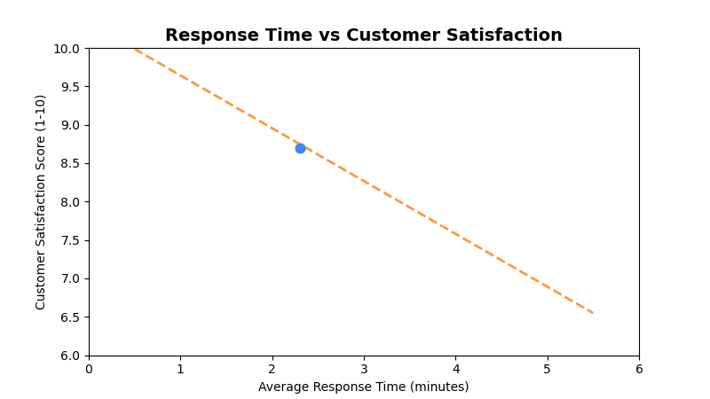
Displays data points on a two-dimensional plane to show correlation between two numeric variables. Perfect for identifying patterns, outliers, and relationships in survey data.
Sample Preview
Best Use Cases
- Response Time vs Satisfaction - Analyze if faster responses correlate with higher satisfaction
- Store Size vs Performance - Compare store metrics against performance indicators
- Demographics vs Satisfaction - Explore relationships between customer attributes and satisfaction
Sample Data Structure
AskRITA UniversalChartData
from askrita.sqlagent.formatters.DataFormatter import UniversalChartData, ChartDataset, DataPoint

scatter_data = UniversalChartData(
    type="scatter",
    title="Response Time vs Customer Satisfaction",
    labels=[],  # Not used for scatter plots
    datasets=[
        ChartDataset(
            label="Store Performance",
            data=[
                DataPoint(x=2.3, y=8.7),  # Response time vs satisfaction
                DataPoint(x=3.1, y=8.2),
                DataPoint(x=1.8, y=9.1),
                DataPoint(x=4.2, y=7.5),
                DataPoint(x=2.9, y=8.4),
                DataPoint(x=3.7, y=7.8),
                DataPoint(x=1.5, y=9.3),
                DataPoint(x=5.1, y=6.9)
            ]
        )
    ],
    xAxisLabel="Average Response Time (minutes)",
    yAxisLabel="Customer Satisfaction Score"
)
Google Charts Implementation
HTML Structure
<!DOCTYPE html>
<html>
<head>
    <script type="text/javascript" src="https://www.gstatic.com/charts/loader.js"></script>
</head>
<body>
    <div id="scatter_chart" style="width: 900px; height: 500px;"></div>
</body>
</html>
JavaScript Code
google.charts.load('current', {'packages':['corechart']});
google.charts.setOnLoadCallback(drawScatterChart);

function drawScatterChart() {
    var data = google.visualization.arrayToDataTable([
        ['Response Time (min)', 'Satisfaction Score'],
        [2.3, 8.7],
        [3.1, 8.2],
        [1.8, 9.1],
        [4.2, 7.5],
        [2.9, 8.4],
        [3.7, 7.8],
        [1.5, 9.3],
        [5.1, 6.9],
        [2.7, 8.6],
        [3.9, 7.3],
        [2.1, 8.9],
        [4.8, 7.1],
        [1.9, 9.0],
        [3.4, 8.0],
        [4.5, 7.2]
    ]);

    var options = {
        title: 'Response Time vs Customer Satisfaction',
        titleTextStyle: {
            fontSize: 18,
            bold: true
        },
        width: 900,
        height: 500,
        hAxis: {
            title: 'Average Response Time (minutes)',
            minValue: 0,
            maxValue: 6
        },
        vAxis: {
            title: 'Customer Satisfaction Score (1-10)',
            minValue: 6,
            maxValue: 10
        },
        colors: ['#4285f4'],
        backgroundColor: 'white',
        chartArea: {
            left: 80,
            top: 80,
            width: '80%',
            height: '70%'
        },
        pointSize: 8,
        pointShape: 'circle',
        trendlines: {
            0: {
                type: 'linear',
                color: '#ff7f0e',
                lineWidth: 2,
                opacity: 0.8,
                showR2: true,
                visibleInLegend: true
            }
        }
    };

    var chart = new google.visualization.ScatterChart(document.getElementById('scatter_chart'));
    chart.draw(data, options);
}
Multi-Series Scatter Chart
function drawMultiSeriesScatterChart() {
    var data = google.visualization.arrayToDataTable([
        ['Store Size (sq ft)', 'Retail Store', 'Walk-in Clinic', 'Wellness Center'],
        [8000, 8.2, null, null],
        [12000, 8.4, null, null],
        [15000, 8.6, null, null],
        [6000, null, 8.7, null],
        [8000, null, 8.9, null],
        [10000, null, 9.1, null],
        [20000, null, null, 8.0],
        [25000, null, null, 8.3],
        [30000, null, null, 8.5]
    ]);

    var options = {
        title: 'Store Size vs Satisfaction by Service Type',
        hAxis: {
            title: 'Store Size (square feet)',
            format: '#,###'
        },
        vAxis: {
            title: 'Customer Satisfaction Score',
            minValue: 7.5,
            maxValue: 9.5
        },
        colors: ['#4285f4', '#34a853', '#fbbc04'],
        pointSize: 10,
        series: {
            0: { pointShape: 'circle' },
            1: { pointShape: 'triangle' },
            2: { pointShape: 'square' }
        }
    };

    var chart = new google.visualization.ScatterChart(document.getElementById('scatter_chart'));
    chart.draw(data, options);
}
React Implementation
import React, { useEffect, useRef } from 'react';

interface ScatterChartProps {
    data: Array<{
        x: number;
        y: number;
        series?: string;
        label?: string;
    }>;
    title?: string;
    width?: number;
    height?: number;
    xAxisLabel?: string;
    yAxisLabel?: string;
    showTrendline?: boolean;
}

const ScatterChart: React.FC<ScatterChartProps> = ({
    data,
    title = "Scatter Chart",
    width = 900,
    height = 500,
    xAxisLabel = "X Axis",
    yAxisLabel = "Y Axis",
    showTrendline = false
}) => {
    const chartRef = useRef<HTMLDivElement>(null);

    useEffect(() => {
        if (!window.google || !chartRef.current) return;

        // Group data by series if multi-series
        const series = [...new Set(data.map(item => item.series || 'Default'))];

        if (series.length === 1) {
            // Single series
            const chartData = new google.visualization.DataTable();
            chartData.addColumn('number', xAxisLabel);
            chartData.addColumn('number', yAxisLabel);

            const rows = data.map(item => [item.x, item.y]);
            chartData.addRows(rows);

            const options = {
                title: title,
                width: width,
                height: height,
                hAxis: { title: xAxisLabel },
                vAxis: { title: yAxisLabel },
                colors: ['#4285f4'],
                pointSize: 8,
                trendlines: showTrendline ? {
                    0: {
                        type: 'linear',
                        color: '#ff7f0e',
                        lineWidth: 2,
                        opacity: 0.8,
                        showR2: true
                    }
                } : {}
            };

            const chart = new google.visualization.ScatterChart(chartRef.current);
            chart.draw(chartData, options);
        } else {
            // Multi-series implementation
            const chartData = new google.visualization.DataTable();
            chartData.addColumn('number', xAxisLabel);
            series.forEach(s => chartData.addColumn('number', s));

            // Create sparse matrix for multi-series data
            const xValues = [...new Set(data.map(item => item.x))].sort((a, b) => a - b);
            const rows = xValues.map(x => {
                const row = [x];
                series.forEach(s => {
                    const point = data.find(item => item.x === x && (item.series || 'Default') === s);
                    row.push(point ? point.y : null);
                });
                return row;
            });

            chartData.addRows(rows);

            const options = {
                title: title,
                width: width,
                height: height,
                hAxis: { title: xAxisLabel },
                vAxis: { title: yAxisLabel },
                colors: ['#4285f4', '#34a853', '#fbbc04', '#ea4335'],
                pointSize: 8
            };

            const chart = new google.visualization.ScatterChart(chartRef.current);
            chart.draw(chartData, options);
        }
    }, [data, title, width, height, xAxisLabel, yAxisLabel, showTrendline]);

    return <div ref={chartRef} style={{ width: `${width}px`, height: `${height}px` }} />;
};

export default ScatterChart;
Survey Data Examples
Wait Time vs Satisfaction Analysis
// Analyze relationship between wait time and satisfaction
var data = google.visualization.arrayToDataTable([
    ['Wait Time (minutes)', 'Satisfaction Score', 'Store ID'],
    [2, 9.2, 'Store A'],
    [5, 8.7, 'Store B'],
    [3, 8.9, 'Store C'],
    [8, 7.8, 'Store D'],
    [1, 9.5, 'Store E'],
    [12, 6.9, 'Store F'],
    [4, 8.5, 'Store G'],
    [7, 8.1, 'Store H'],
    [15, 6.2, 'Store I'],
    [6, 8.3, 'Store J']
]);

var options = {
    title: 'Wait Time Impact on Customer Satisfaction',
    hAxis: {
        title: 'Average Wait Time (minutes)',
        minValue: 0
    },
    vAxis: {
        title: 'Customer Satisfaction Score',
        minValue: 5,
        maxValue: 10
    },
    trendlines: {
        0: {
            type: 'linear',
            color: '#ea4335',
            lineWidth: 3,
            opacity: 0.7,
            showR2: true,
            visibleInLegend: true
        }
    },
    pointSize: 10
};
Customer Demographics vs NPS
// Age vs NPS score correlation
var data = google.visualization.arrayToDataTable([
    ['Customer Age', 'NPS Score', 'Response Count'],
    [25, 45, 150],
    [35, 62, 280],
    [45, 71, 320],
    [55, 78, 450],
    [65, 82, 380],
    [75, 85, 220],
    [30, 52, 190],
    [40, 68, 310],
    [50, 74, 420],
    [60, 80, 390],
    [70, 84, 250]
]);

var options = {
    title: 'Customer Age vs NPS Score',
    hAxis: {
        title: 'Customer Age',
        minValue: 20,
        maxValue: 80
    },
    vAxis: {
        title: 'NPS Score',
        minValue: 0,
        maxValue: 100
    },
    bubble: {
        textStyle: {
            fontSize: 11
        }
    },
    sizeAxis: {
        minValue: 0,
        maxSize: 20
    }
};

// Use bubble chart for three dimensions
var chart = new google.visualization.BubbleChart(document.getElementById('scatter_chart'));
Store Performance Matrix
// Store performance across two key metrics
var data = google.visualization.arrayToDataTable([
    ['Customer Volume', 'Satisfaction Score', 'Store Type'],
    [1200, 8.2, 'Urban'],
    [800, 8.7, 'Suburban'],
    [1500, 7.9, 'Urban'],
    [600, 9.1, 'Rural'],
    [2000, 7.5, 'Urban'],
    [900, 8.5, 'Suburban'],
    [400, 9.3, 'Rural'],
    [1800, 7.8, 'Urban'],
    [700, 8.8, 'Suburban'],
    [500, 9.0, 'Rural']
]);

var options = {
    title: 'Store Performance: Volume vs Satisfaction',
    hAxis: {
        title: 'Monthly Customer Volume',
        format: '#,###'
    },
    vAxis: {
        title: 'Average Satisfaction Score',
        minValue: 7,
        maxValue: 10
    },
    series: {
        0: { color: '#4285f4', pointShape: 'circle' },    // Urban
        1: { color: '#34a853', pointShape: 'triangle' },  // Suburban
        2: { color: '#fbbc04', pointShape: 'square' }     // Rural
    },
    pointSize: 12
};
Advanced Features
Bubble Chart (3D Scatter)
function drawBubbleChart() {
    var data = google.visualization.arrayToDataTable([
        ['ID', 'Customer Volume', 'Satisfaction', 'Store Size', 'Region'],
        ['Store A', 1200, 8.2, 15000, 'Northeast'],
        ['Store B', 800, 8.7, 12000, 'Southeast'],
        ['Store C', 1500, 7.9, 18000, 'Northeast'],
        ['Store D', 600, 9.1, 8000, 'Midwest'],
        ['Store E', 2000, 7.5, 25000, 'West']
    ]);

    var options = {
        title: 'Store Performance Analysis (Volume, Satisfaction, Size)',
        hAxis: { title: 'Monthly Customer Volume' },
        vAxis: { title: 'Customer Satisfaction Score' },
        bubble: {
            textStyle: {
                fontSize: 12,
                fontName: 'Arial',
                color: 'white',
                bold: true
            }
        },
        sizeAxis: {
            minValue: 5000,
            maxValue: 30000,
            minSize: 10,
            maxSize: 30
        },
        colorAxis: {
            colors: ['#4285f4', '#34a853', '#fbbc04', '#ea4335']
        }
    };

    var chart = new google.visualization.BubbleChart(document.getElementById('bubble_chart'));
    chart.draw(data, options);
}
Interactive Scatter with Selection
function drawInteractiveScatterChart() {
    var chart = new google.visualization.ScatterChart(document.getElementById('scatter_chart'));

    google.visualization.events.addListener(chart, 'select', function() {
        var selection = chart.getSelection();
        if (selection.length > 0) {
            var row = selection[0].row;
            var xValue = data.getValue(row, 0);
            var yValue = data.getValue(row, 1);

            showPointDetails(xValue, yValue, row);
        }
    });

    // Add brush selection for zooming
    google.visualization.events.addListener(chart, 'regionClick', function(e) {
        zoomToRegion(e.region);
    });

    chart.draw(data, options);
}

function showPointDetails(x, y, row) {
    const detailPanel = document.getElementById('point-details');
    detailPanel.innerHTML = `
        <h4>Store Details</h4>
        <p>Response Time: ${x} minutes</p>
        <p>Satisfaction: ${y}/10</p>
        <p>Store ID: ${getStoreId(row)}</p>
        <button onclick="loadStoreAnalysis(${row})">View Full Analysis</button>
    `;
    detailPanel.style.display = 'block';
}
Correlation Analysis
function calculateCorrelation(data) {
    const n = data.getNumberOfRows();
    let sumX = 0, sumY = 0, sumXY = 0, sumX2 = 0, sumY2 = 0;

    for (let i = 0; i < n; i++) {
        const x = data.getValue(i, 0);
        const y = data.getValue(i, 1);

        sumX += x;
        sumY += y;
        sumXY += x * y;
        sumX2 += x * x;
        sumY2 += y * y;
    }

    const correlation = (n * sumXY - sumX * sumY) /
        Math.sqrt((n * sumX2 - sumX * sumX) * (n * sumY2 - sumY * sumY));

    return correlation;
}

function displayCorrelationInfo(correlation) {
    const strength = Math.abs(correlation);
    let description;

    if (strength >= 0.7) description = 'Strong';
    else if (strength >= 0.3) description = 'Moderate';
    else description = 'Weak';

    const direction = correlation > 0 ? 'Positive' : 'Negative';

    document.getElementById('correlation-info').innerHTML = `
        <p><strong>Correlation:</strong> ${correlation.toFixed(3)}</p>
        <p><strong>Relationship:</strong> ${description} ${direction}</p>
    `;
}
Key Features
- Correlation Analysis - Shows relationships between two variables
- Trend Lines - Built-in linear regression analysis
- Multiple Series - Compare different groups or categories
- Outlier Detection - Easily spot unusual data points
- Interactive Selection - Click handling for detailed analysis
When to Use
✅ Perfect for: - Correlation analysis - Outlier detection - Relationship exploration - Performance analysis - Quality control charts
❌ Avoid when: - Categorical data - Time series trends - Part-to-whole relationships - Too many data points (>500)
Performance Tips
// For large datasets, consider data sampling
function sampleData(data, maxPoints = 200) {
    if (data.length <= maxPoints) return data;

    const step = Math.floor(data.length / maxPoints);
    return data.filter((_, index) => index % step === 0);
}

// Or use data aggregation for dense regions
function aggregatePoints(data, gridSize = 20) {
    const grid = {};

    data.forEach(point => {
        const gridX = Math.floor(point.x / gridSize) * gridSize;
        const gridY = Math.floor(point.y / gridSize) * gridSize;
        const key = `${gridX},${gridY}`;

        if (!grid[key]) {
            grid[key] = { x: gridX, y: gridY, count: 0, sumX: 0, sumY: 0 };
        }

        grid[key].count++;
        grid[key].sumX += point.x;
        grid[key].sumY += point.y;
    });

    return Object.values(grid).map(cell => ({
        x: cell.sumX / cell.count,
        y: cell.sumY / cell.count,
        size: cell.count
    }));
}